 "ttyymmnn" (ttyymmnn)
04/24/2019 at 10:17 • Filed to: wingspan, Planelopnik
 5
5
 39
39
 "ttyymmnn" (ttyymmnn)
04/24/2019 at 10:17 • Filed to: wingspan, Planelopnik |  5 5
|  39 39 |
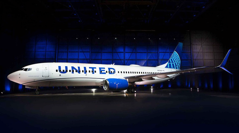
And the crowd goes mild.
This was a long-anticipated reveal, at least in aviation circles. And while there are some differences, there will be no doubt about the continuation of the recognizable branding. And I guess that’s what’s important. Gone is the gold from the globe on the tail, replaced by a light blue, the dark blues are brighter, the United is made larger and moved down the side of the fuselage, the engines nacelles are painted blue, and a blue, curving cheatline is added. In a certain sense, it’s almost a retro livery, and very much in line with other trends these days.
!!! UNKNOWN CONTENT TYPE !!!
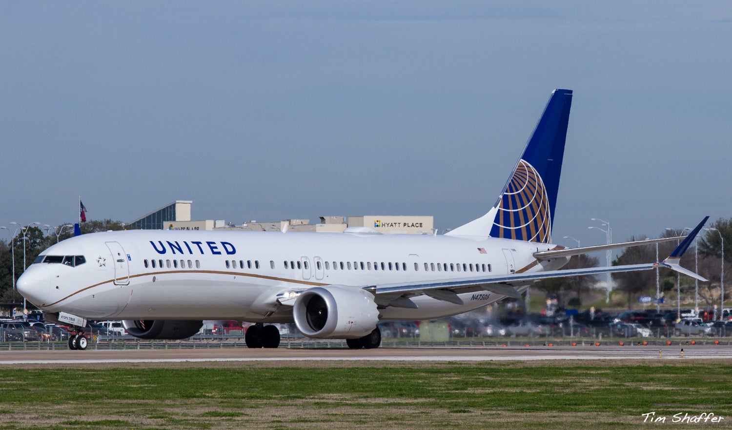
It is certainly not unattractive, but I think they hit the sweetspot with the livery they used on the MAX9, which also gave us the curving cheatline.
Tim Shaffer
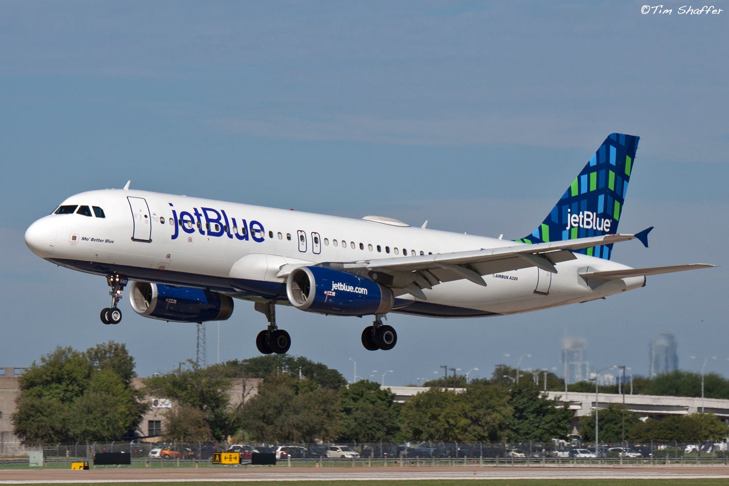
Comparions to JetBlue are inevitable, especially since the blues are more similar now, and the large writing on the side is similar.
Tim Shaffer
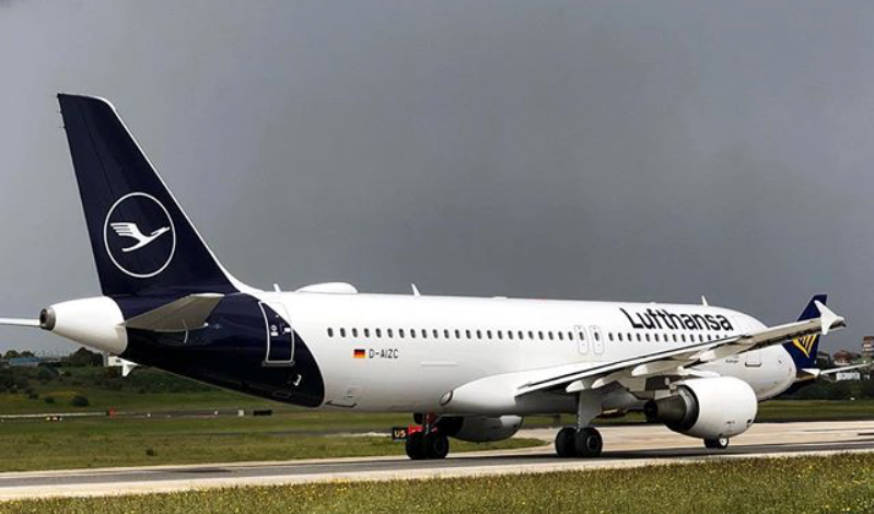
And it continues a trend trend in aviation liveries towards more bold single colors, such as in the new Lufthansa livery, which dumped the iconic golden crane from their tail logo. At least United didn’t follow the new trend of painting the whole empennage. I’ve always been a fan of the classic tail-only paint.
 !!!CAPTION ERROR: MAY BE MULTI-LINE OR CONTAIN LINK!!!
So, at the end of the day, United’s new livery is recognizable, which is important, but it’s certainly not going to win any design awards, at least not from me.
 Highlander-Datsuns are Forever
> ttyymmnn
04/24/2019 at 10:23 |
|
This is what happens when you are huge and corporate, you spend big bucks on branding and get mediocre results.
 ttyymmnn
> Highlander-Datsuns are Forever
04/24/2019 at 10:25 |
|
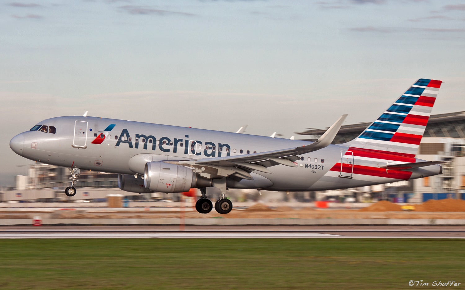
Seriously. I wonder how much they paid for such minimal changes. I’m not crazy about American’s newest livery, but at least they made a bold decision to go in an entirely new direction, and came up with something that is both new and recognizable.
 Highlander-Datsuns are Forever
> ttyymmnn
04/24/2019 at 10:30 |
|
I worked for a very large international firm for a while and rumor was they paid north of $
250-$
500k for a re-
branding exercise that took their name: URS-Griener Woodward Clyde to: URS, in big blue letters. Meanwhile they beat us workers to the closest penny and took
6-8 weeks to pay expense reports.
 facw
> ttyymmnn
04/24/2019 at 10:34 |
|
I think it’s a big improvement over the previous p suedo C ontinental livery. Looks clean and sharp.
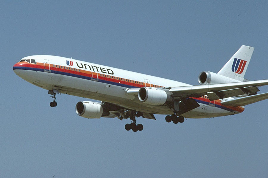
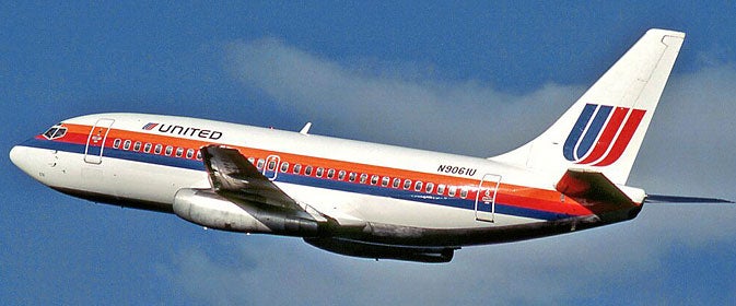
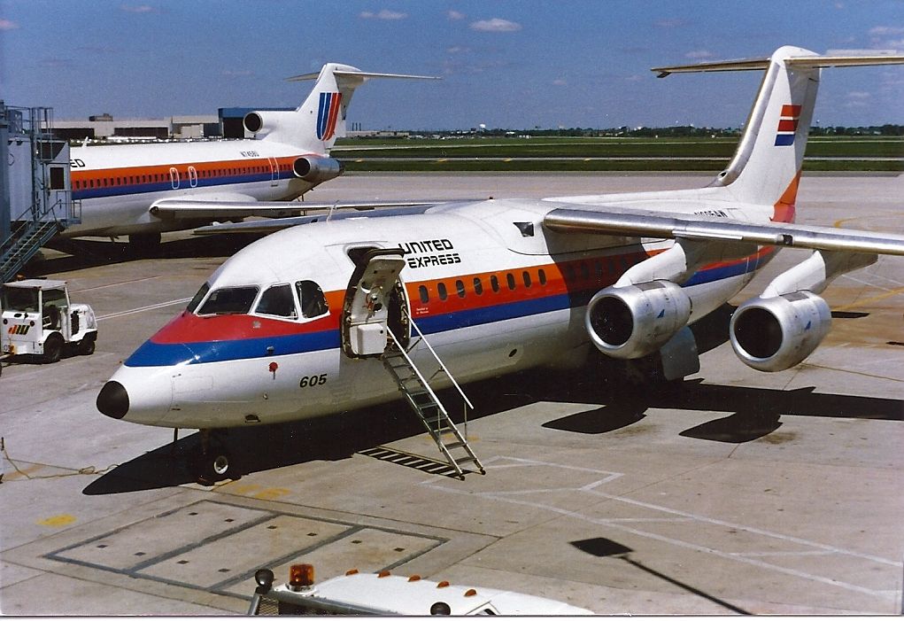
Of course if they were going to lean on an old livery, it should have been this one:
 facw
> ttyymmnn
04/24/2019 at 10:34 |
|
I think the American one ended up pretty terrible, though I guess you’re right that it’s distinctively so.
 ttyymmnn
> facw
04/24/2019 at 10:39 |
|
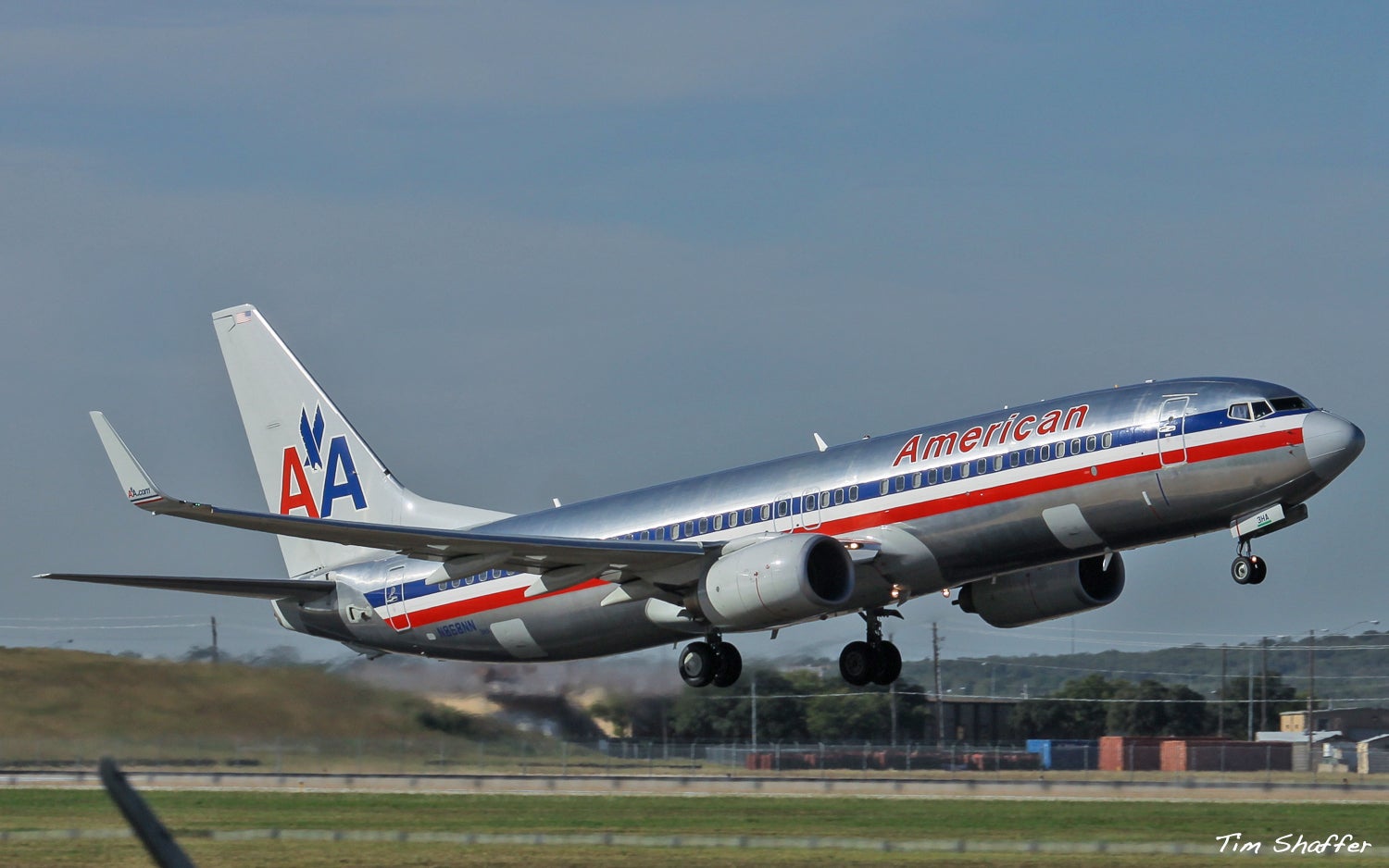
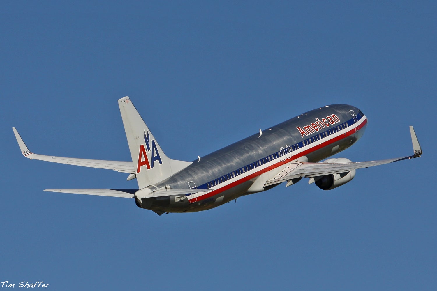
I guess they went with the boring gray because it mimicked the old aluminum. I think it would have looked better if it were brighter. Bring back the polished aluminum! It certainly photographs better with more contrast. Although it was definitely getting tired.
 ttyymmnn
> facw
04/24/2019 at 10:41 |
|
That is certainly classic, but I think it’s very 80s , in the same way American’s previous livery seemed very 70s. They could have used that old U logo though, with updated colors. It is certainly still recognizable.
 benjrblant
> ttyymmnn
04/24/2019 at 10:44 |
|
RIP Continental.
 For Sweden
> ttyymmnn
04/24/2019 at 10:44 |
|
They would paint the windows blue, if they weren’t cowards
 Thomas Donohue
> ttyymmnn
04/24/2019 at 10:47 |
|
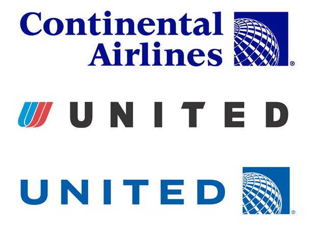
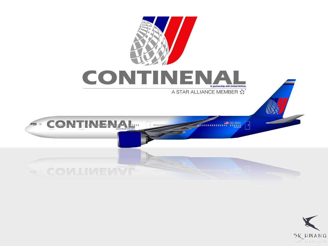
Really not to different than what the original merged logo looked like. I kinda like the painted engines, and I won’t miss the gold.
Something with a little more color would have been better.
 facw
> ttyymmnn
04/24/2019 at 10:47 |
|
I’d say it’s more ‘70s (but in a ‘70s futurist way), but yeah it is clearly associated with an era. Still, a modern take could work well. Many people seem unwilling to forgive United for ditching the ‘Tulip’, but with apologies to Saul Bass, while it’s become iconic, I don’t think it’s one of his better logos .
 benn454
> ttyymmnn
04/24/2019 at 10:48 |
|
That's incredibly boring looking. Also, the trend of having your letters broken up by windows looks terrible.
 TheRealBicycleBuck
> ttyymmnn
04/24/2019 at 10:48 |
|
I’ll admit it , I had to look up why they were cheating on their lines....
 ttyymmnn
> benjrblant
04/24/2019 at 10:48 |
|
 benn454
> facw
04/24/2019 at 10:49 |
|
At least it's not boring.
 ttyymmnn
> Thomas Donohue
04/24/2019 at 10:51 |
|
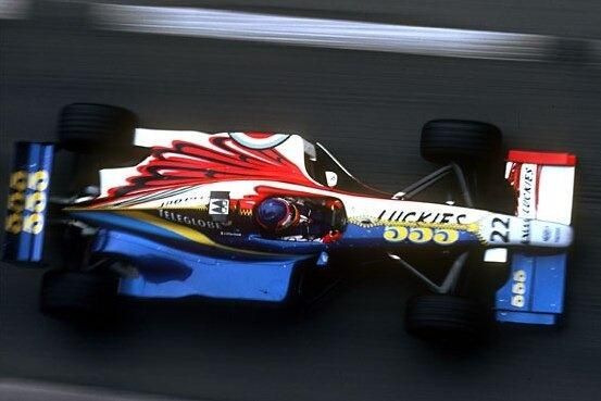
That last concept is interesting, but I think the tail logo is too busy. Maybe they should have gone with something like the Williams Lucky Strike/555 livery from back in the cigarette days.
 ttyymmnn
> facw
04/24/2019 at 10:52 |
|
I’d say it’s more ‘70s (but in a ‘70s futurist way)
Nicely put.
 For Sweden
> ttyymmnn
04/24/2019 at 10:52 |
|
Also the “oh no our livery depends on polished aluminum and we just bought a bunch of composite airplanes” direction
 ttyymmnn
> benn454
04/24/2019 at 10:52 |
|
Most of the new liveries are boring and mostly monochromatic. I think Lufthansa is one of the worst updates.
 facw
> ttyymmnn
04/24/2019 at 10:54 |
|
Yeah, the gray is too drab. Possibly with a bolder use of color elsewhere it would work better. United’s ‘90's livery (which is as much a style of an era as the orange one) was a putty gray, but offset with ventral blue, so it wasn’t just a gray mass:
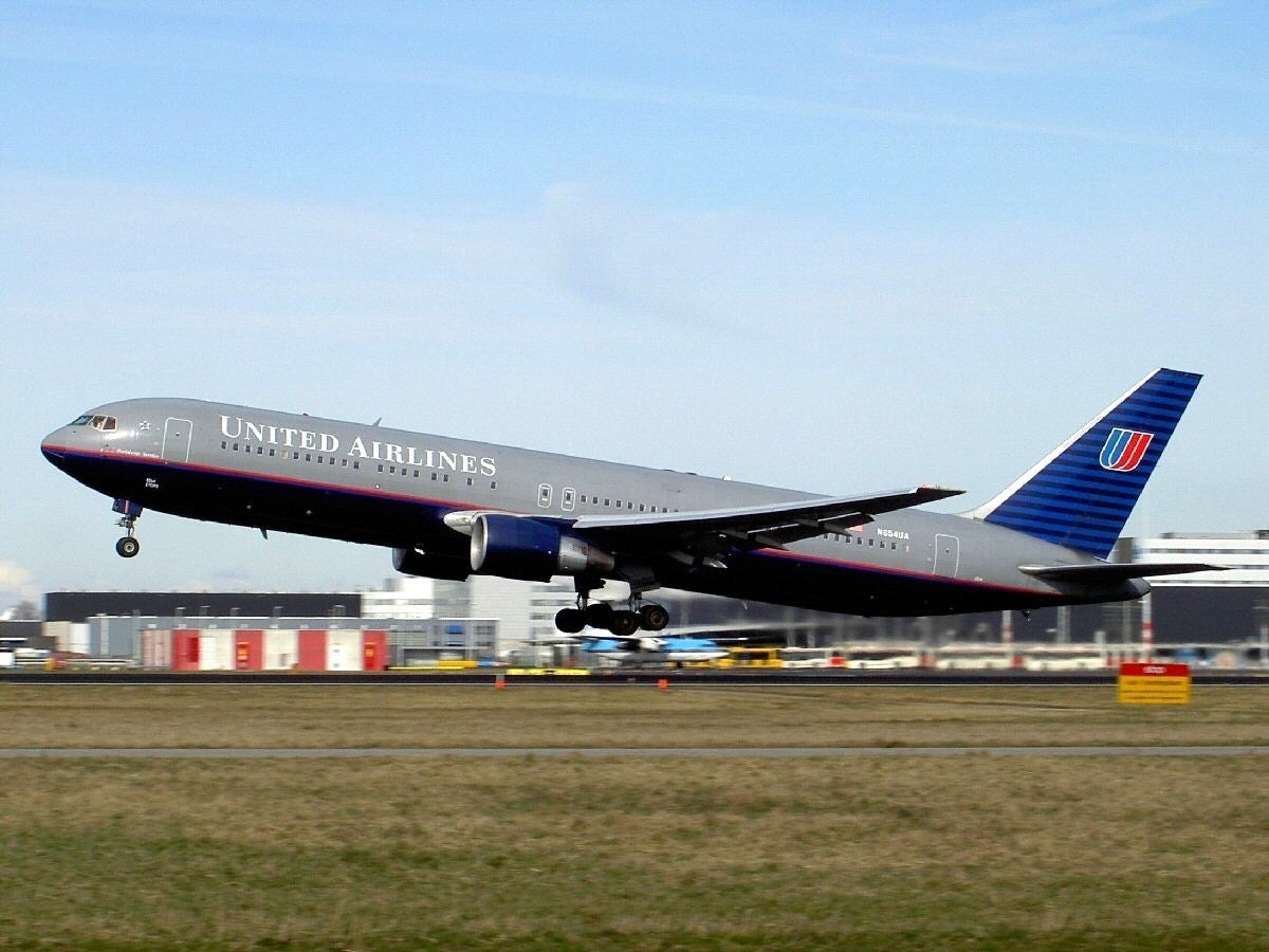
Alternatively, maybe using a bright silver paint instead of a gray would have done better for American. I think the tail would still be lackluster regardless of how they handled the gray though.
 Ash78, voting early and often
> ttyymmnn
04/24/2019 at 10:54 |
|
That arch delineates where Basic Economy ends and Simple Economy begins. If you want to use the toilet, you have to spring for Interim Economy or Economy Plus. And if you’re rich, maybe Economy Supreme.
 For Sweden
> ttyymmnn
04/24/2019 at 10:55 |
|
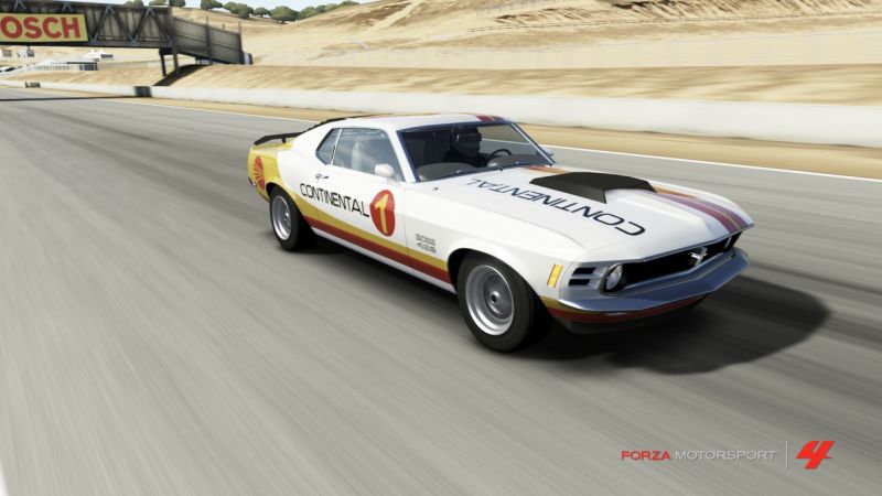
[reaches deep, deep, DEEP into the archives of my old posts]
 ttyymmnn
> TheRealBicycleBuck
04/24/2019 at 10:55 |
|
I came across an interesting article in Airliners magazine form 1998. I had a friend send it to me through interlibrary loan. It’s all about how airliners started ditching the cheatline back in the late 80s and early 90s. I can email it to you if you want to give me an @.
 ttyymmnn
> facw
04/24/2019 at 10:57 |
|
I had forgotten that UAL livery. I think it would still look good with a sans serif font, or big letters in the same blue.
 TheRealBicycleBuck
> ttyymmnn
04/24/2019 at 10:58 |
|
bicycle buck @ gmail
 ttyymmnn
> For Sweden
04/24/2019 at 10:59 |
|
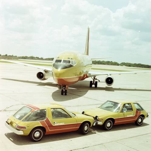
Counterpoint:
 ttyymmnn
> TheRealBicycleBuck
04/24/2019 at 11:01 |
|
Attachment is too big. I’ll put it on Google Drive at some point today.
 facw
> ttyymmnn
04/24/2019 at 11:02 |
|
I like it as well (not as much as the one it replaced of course). My biggest complaint is how similar it felt to the US Air livery of the same time period:
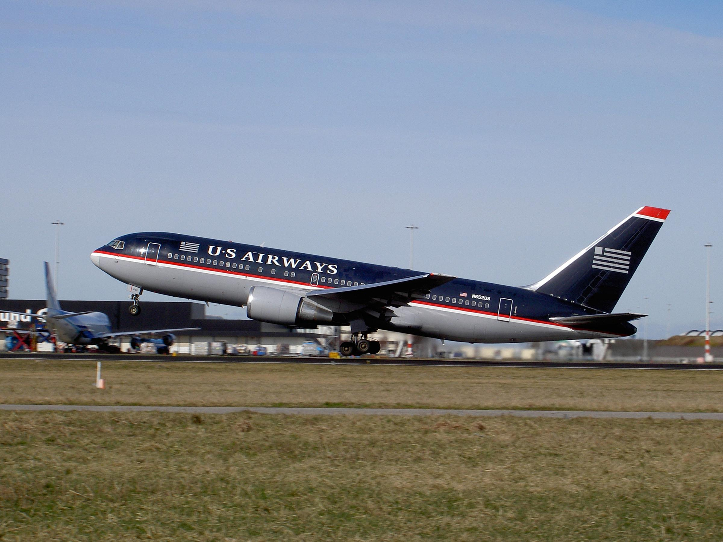
I also liked that one (aside from having the wrong number of stripes on the flag, which felt weird), but having two major airlines using dark blue and gray planes with red stripes and white serif text at the same time seemed excessive.
 ttyymmnn
> facw
04/24/2019 at 11:05 |
|
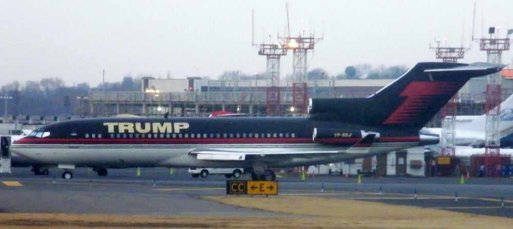
My biggest complaint with that stylized flag isn’t so much the stripes as that the jack is too small. The proportions are all wrong. And now, that reminds me too much of this:
 facw
> ttyymmnn
04/24/2019 at 11:07 |
|
Yep, I don’t know why the messed with the proportions. If they wan ted to go with a minimalist version, they could have just gone with two solid boxes in the right proportions.
 benn454
> ttyymmnn
04/24/2019 at 11:12 |
|
I guess they can't all be Southwest.
 Full of the sound of the Gran Fury, signifying nothing.
> ttyymmnn
04/24/2019 at 12:44 |
|
Wake me up when they go to something interesting...

 f86sabre
> For Sweden
04/24/2019 at 12:44 |
|
Truth.
 f86sabre
> ttyymmnn
04/24/2019 at 12:50 |
|
As much as I would like bolder schemes all around, white fuselages are easier to cool on the ramp and in flight. Lots of airlines, ours included, are running blue inlets and cowls. Joining the bandwagon means that if they have to borrow one, and this happens a bit, that their plane isn’t buzzing around with wildly mismatched paint.
 BaconSandwich is tasty.
> ttyymmnn
04/24/2019 at 14:06 |
|
Different branding. Same crappy service.
 Highlander-Datsuns are Forever
> For Sweden
04/24/2019 at 14:19 |
|
C
hrome
plate
all the things.
 Highlander-Datsuns are Forever
> ttyymmnn
04/24/2019 at 14:33 |
|
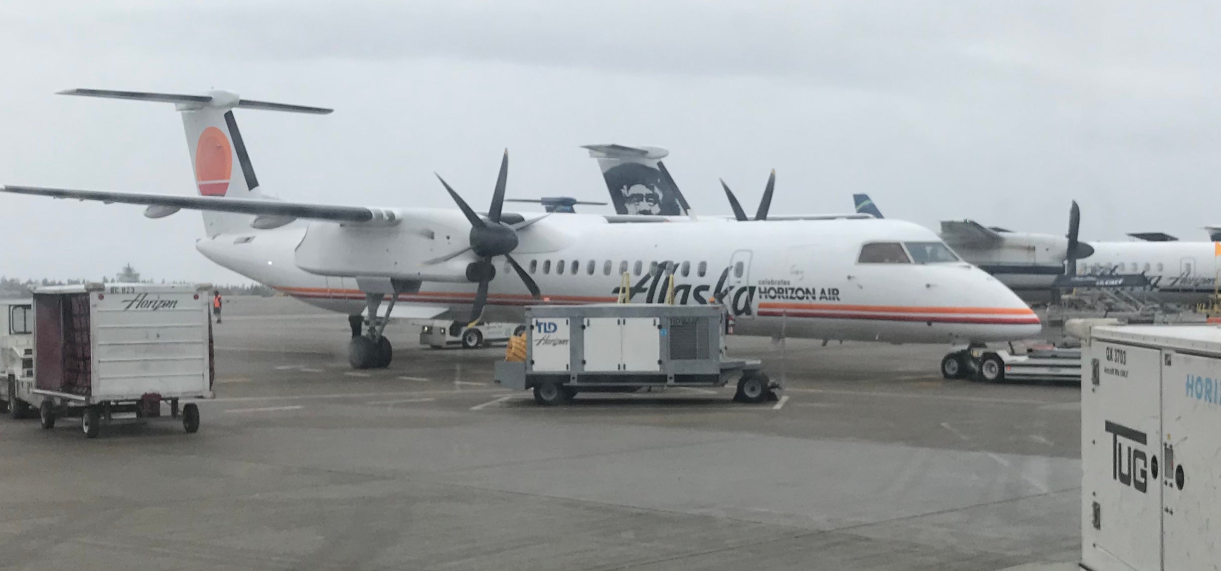
I got this one photographed last week.
 ttyymmnn
> Highlander-Datsuns are Forever
04/24/2019 at 15:49 |
|
Nice! We don’t see those much round here.
 Highlander-Datsuns are Forever
> ttyymmnn
04/24/2019 at 15:54 |
|
I don’t think the Dash-8's go further east then salt lake or denver. Primarily a PNW air
pla
ne
and my go to for flights out of FCA to SEATAC.